From time to time, it can get quite complicated even to a trained graphic artist or illustrator what rules to follow and what to modify. And I must admit, it makes me feel better to see that I'm not the only one making these types of mistakes. We all strive to do the best we can for our clients, but we are also human. The trick is to laugh about it, and learn for the next time.
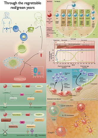
What I'm talking about specifically is that when we use the power of color coding to help make association in concepts digestible. But in the application of one color theory rule we sometimes make less obvious errors. Take for instance, using complimentary colors to associate two objects within a picture. Complimentary colors are pairs of colors opposite each other on the color wheel: blue and orange, yellow and purple, and red and green, for instance. We employ these color combinations together because visually they accentuate each other the best.
However, the use of red juxtaposed against green poses problems for color-blinded individuals, which as we stated in an earlier post, affects 1 in 10 men. So for images used in the science fields we aim to NOT follow the complimentary rule for this one particular pair.
Therefore, I'd like to leave you with an homage to many of the red and green mistakes I have made in the past, in hopes that they will only be distant memories!
 RSS Feed
