SLEEP
HERO ILLUSTRATION. Credit: Alice Kitterman/U.S. National Science Foundation.
A huge part of our daily lives is taken up by sleep. We have come to think of sleep as the restful part of our cyclical world, but so much is happening within our brains that we're just beginning to unravel.
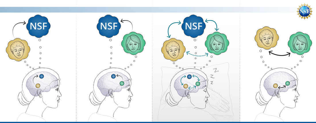
The hero image and animation I created for this U.S. National Science Foundation Science Matters article, demonstrates one amazing phenomenon about our brain: memory association between two unrelated events that are spatially related in time.
To create a short animation that shows how this memory association occurs, I relied on two foundational illustration techniques: highlighting visual differences by keeping all other elements identical, and color coding.
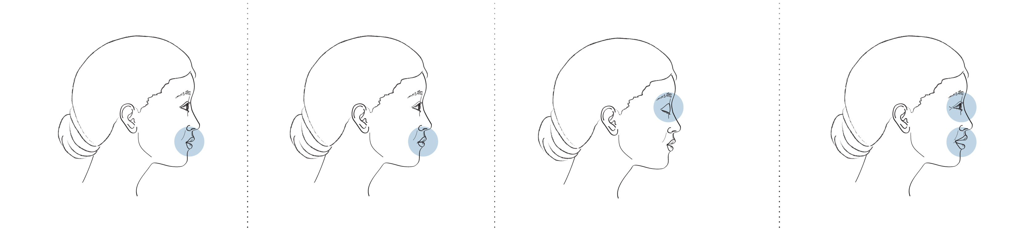
First, to emphasize visual differences, I used the exact same profile view of the person's head, and only made changes to the facial expression (highlighted in light blue) to denote that 4 discrete events in time are passing: her mouth opens from the first to the second scene, her eye closes from second to third, and her eye is open and she is smiling in the last scene.
The hero image and animation I created for this U.S. National Science Foundation Science Matters article, demonstrates one amazing phenomenon about our brain: memory association between two unrelated events that are spatially related in time.
To create a short animation that shows how this memory association occurs, I relied on two foundational illustration techniques: highlighting visual differences by keeping all other elements identical, and color coding.
First, to emphasize visual differences, I used the exact same profile view of the person's head, and only made changes to the facial expression (highlighted in light blue) to denote that 4 discrete events in time are passing: her mouth opens from the first to the second scene, her eye closes from second to third, and her eye is open and she is smiling in the last scene.
Next, I overlayed a body position to fit the profile of the head:
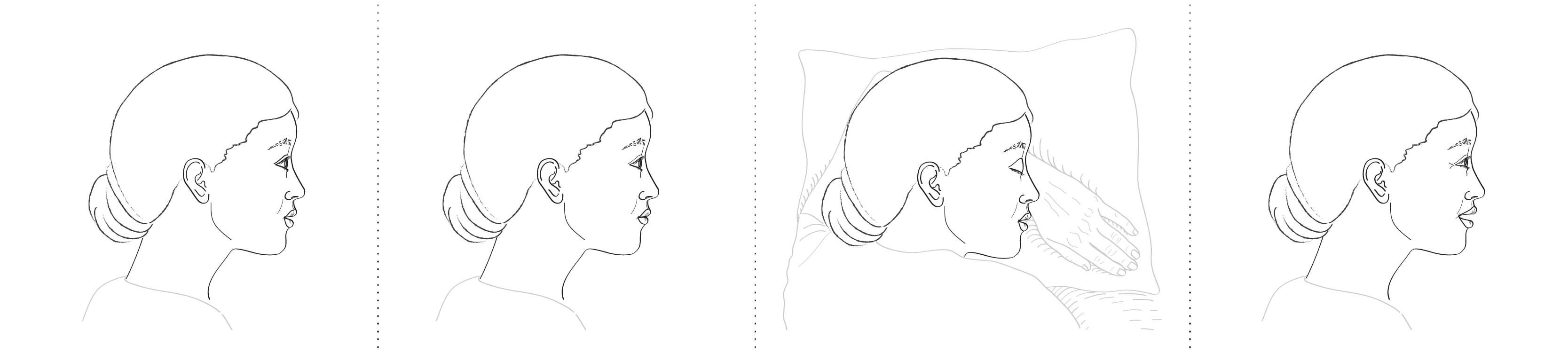
This technique reinforces that time-wise, these events are closely related, and further benefits the color coding technique because the setting in each event is almost identical.
Finally, simply color coding each discrete memory makes it easy for the viewer to follow what is related to what (memories are the thought-bubble shapes, and the neuron clusters are the circles below). And keeping everything else as consistent as possible--like shape or placement on screen--also helps to highlight the difference between each event.
Finally, simply color coding each discrete memory makes it easy for the viewer to follow what is related to what (memories are the thought-bubble shapes, and the neuron clusters are the circles below). And keeping everything else as consistent as possible--like shape or placement on screen--also helps to highlight the difference between each event.
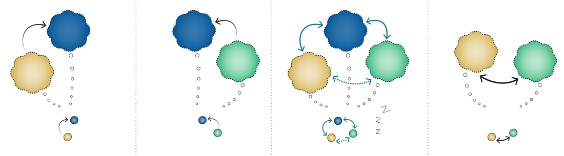
The result, in theory, should be 4 very similar images whereby the difference from one scene to the next can be easily detected by the viewer.
To read the article and view the animation: new.nsf.gov/science-matters/nightlife-brain
Thanks to my colleague at NSF, Nate Pottker, for the audio effects in this animation.
Thanks to my colleague at NSF, Nate Pottker, for the audio effects in this animation.
CO-llaboration
I recently delivered a suite of visuals for an NSF Science Matters article entitled, “The bubble-bursting, causality-revealing awesomeness of randomized controlled trials.”
This article tells the story of how 3 economists applied the randomized controlled trial (RCT)—of drug trial fame—to reveal true causality behind problems confounded by unpredictable human behavior.
This process was a testament to a collaborative endeavor where each contributor (clients, colleagues, Creative Lead and Art Director) played an integral, analytical, and most importantly, thoughtful role.
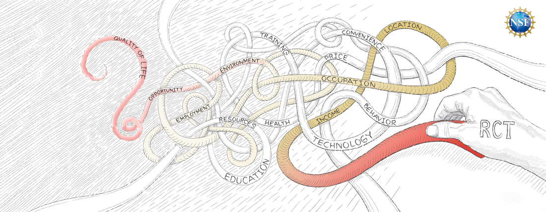
HERO ILLUSTRATION. Credit: Alice Kitterman/U.S. National Science Foundation.
The biggest challenge was deciding what icons or symbols to use for abstract concepts. I didn't want to use a past RCT study as was initially suggested, because I wanted the products to be evergreen, and so imagery from a specific study would tie the image to that single experiment.
While the hero image had to be attention-grabbing and compelling to get viewers to read on, determining keywords to represent how RCTs work within the behavioral economics space was a challenge. Examples of what we ended up with: Improving quality of life, random, cause and effect, hidden cause, trial and error, and iterative process. The concepts to follow were inspired from these.
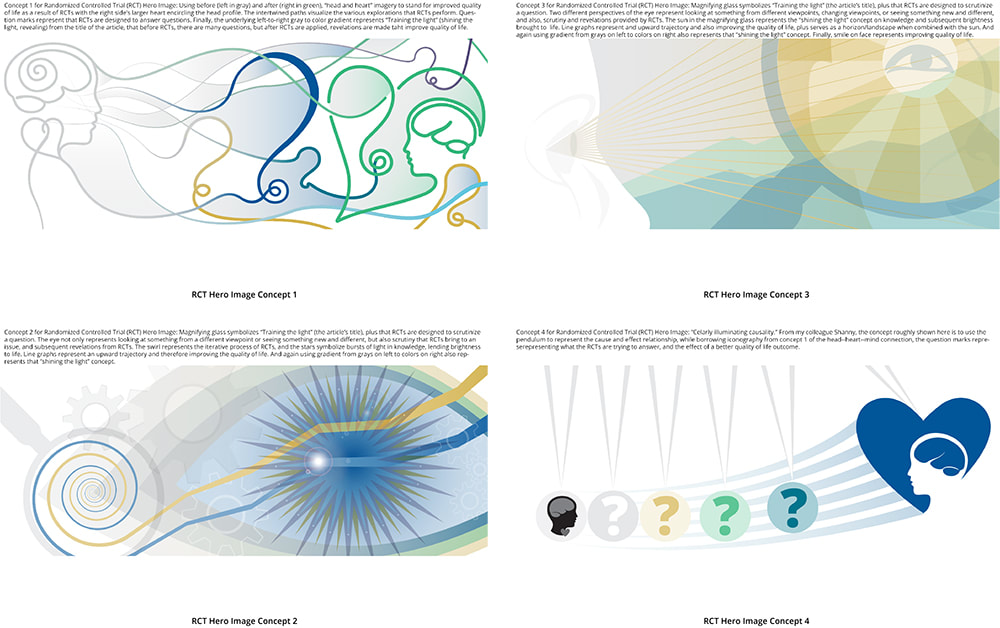
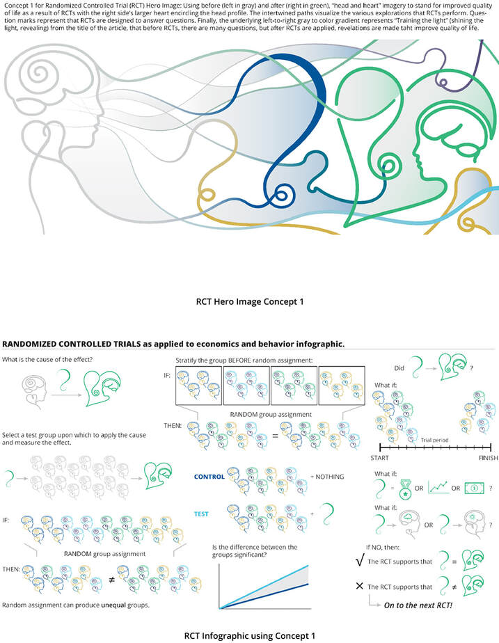
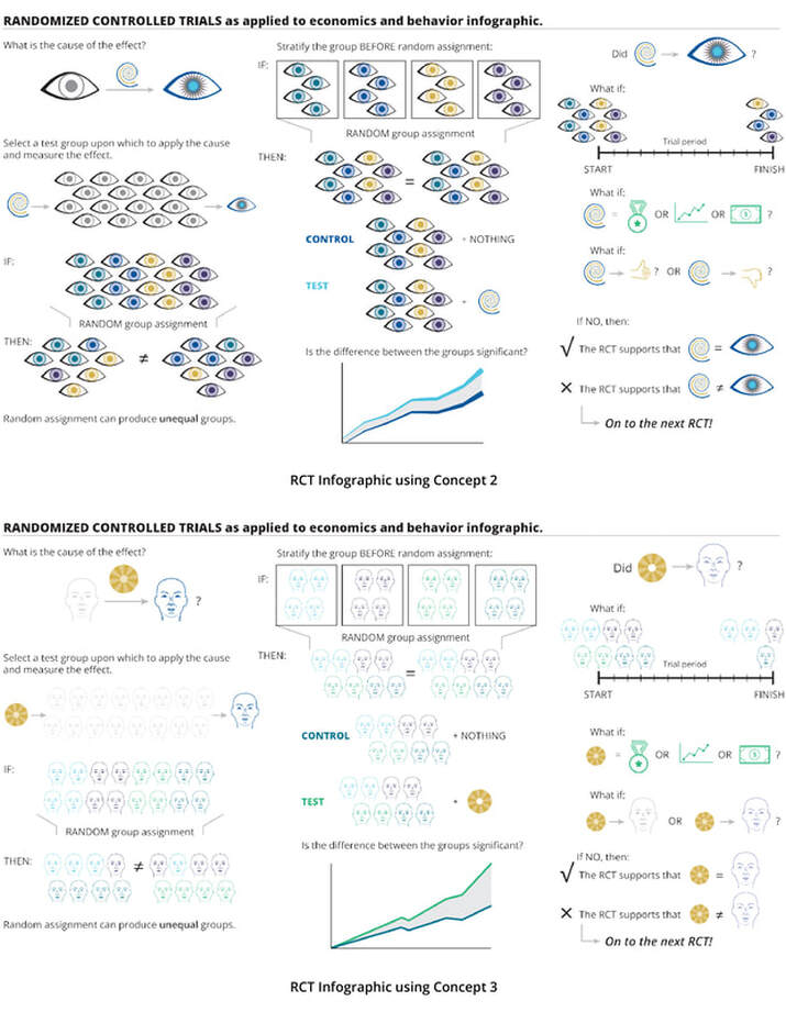
Concept 1 reflects the iterative process of RCTs, likening it to a journey of winding and interweaving paths and using a "grayscale to color" effect to convey the revealing effects of RCTs. Concepts 2 and 3 use key symbols in a collage (eye, magnifying glass, rays of light/sun, head and heart, question marks, data lines/graphs) and convey the RCT process in a simple left to right reading orientation. A final analogy contributed by a colleague and fleshed out by me demonstrates "cause and effect," through the Newton's cradle object (concept 4):
The biggest challenge was deciding what icons or symbols to use for abstract concepts. I didn't want to use a past RCT study as was initially suggested, because I wanted the products to be evergreen, and so imagery from a specific study would tie the image to that single experiment.
While the hero image had to be attention-grabbing and compelling to get viewers to read on, determining keywords to represent how RCTs work within the behavioral economics space was a challenge. Examples of what we ended up with: Improving quality of life, random, cause and effect, hidden cause, trial and error, and iterative process. The concepts to follow were inspired from these.
Concept 1 reflects the iterative process of RCTs, likening it to a journey of winding and interweaving paths and using a "grayscale to color" effect to convey the revealing effects of RCTs. Concepts 2 and 3 use key symbols in a collage (eye, magnifying glass, rays of light/sun, head and heart, question marks, data lines/graphs) and convey the RCT process in a simple left to right reading orientation. A final analogy contributed by a colleague and fleshed out by me demonstrates "cause and effect," through the Newton's cradle object (concept 4):
First-round drafts for the hero illustration concept. Credit: A. Kitterman/National Science Foundation.
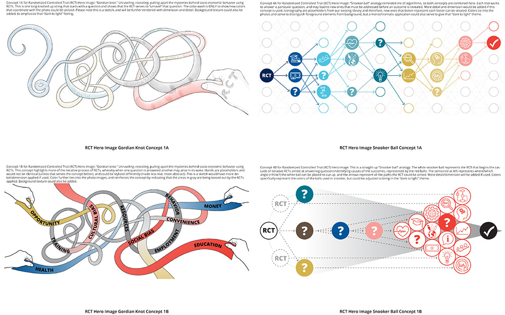
Putting images to paper jogged the memory and triggered the flow of ideas for the client, and two of the concepts stood out: #1, for the entangled strands reminded him of a "Gordian knot," and #4, the Newton's cradle which reminded him of the game Snooker. These were further developed next, and four of six versions are shown below:
Putting images to paper jogged the memory and triggered the flow of ideas for the client, and two of the concepts stood out: #1, for the entangled strands reminded him of a "Gordian knot," and #4, the Newton's cradle which reminded him of the game Snooker. These were further developed next, and four of six versions are shown below:
Second-round drafts for the hero illustration concept. Credit: A. Kitterman/National Science Foundation.
The client ultimately chose the concept based on the Gordian knot (upper left image). While the game Snooker was an easy-to-follow, straightforward "cause and effect" analogy, the Gordian Knot captured more of the complexity and subtleties of the RCT process, with some knots unraveling easily while others being tougher to undo.
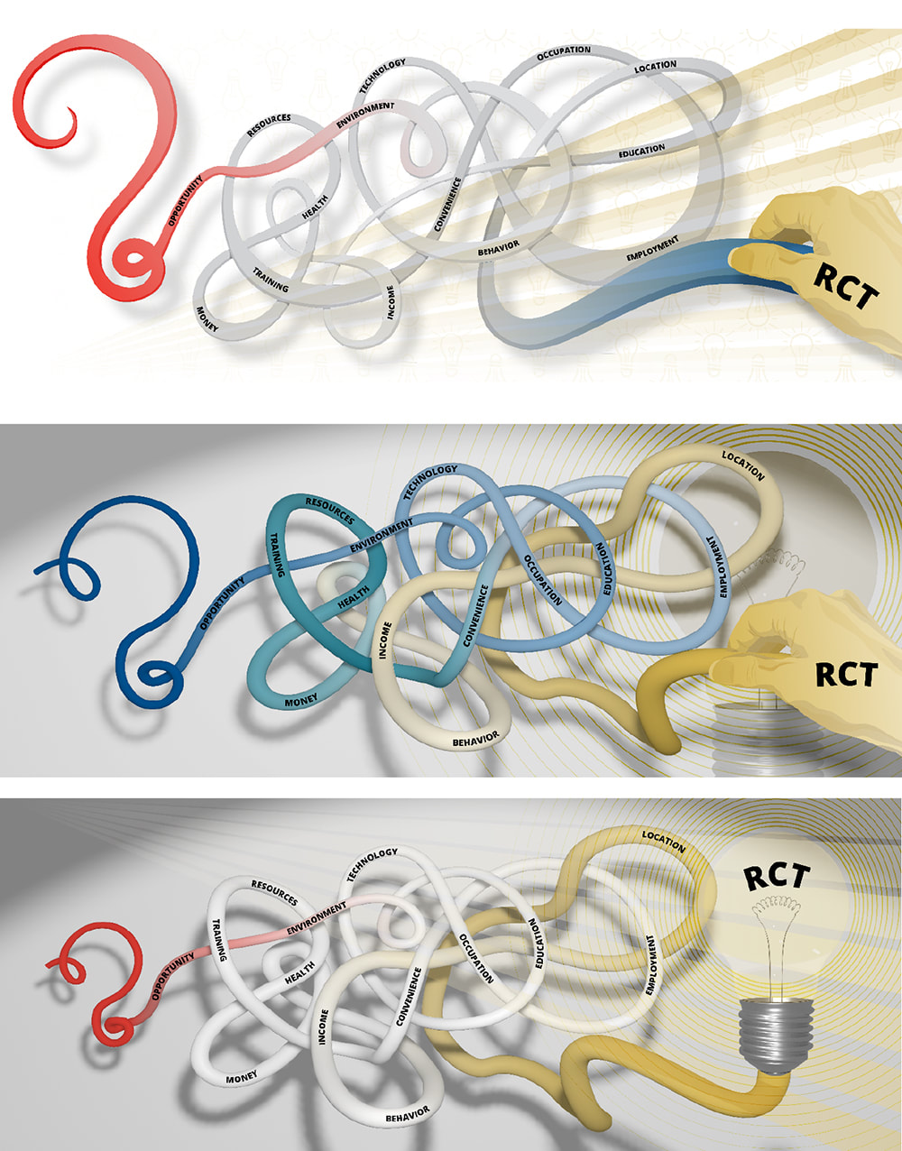
Now came the fun part: how to execute the final art? I'm an Illustrator FanGirl, but also LOVE Blender so, and thus I ended up building the entangled string for kicks to see how a 3D version could look (see the bottom two drafts):
The client ultimately chose the concept based on the Gordian knot (upper left image). While the game Snooker was an easy-to-follow, straightforward "cause and effect" analogy, the Gordian Knot captured more of the complexity and subtleties of the RCT process, with some knots unraveling easily while others being tougher to undo.
Now came the fun part: how to execute the final art? I'm an Illustrator FanGirl, but also LOVE Blender so, and thus I ended up building the entangled string for kicks to see how a 3D version could look (see the bottom two drafts):
First-round drafts for the final style of the hero illustration. Credit: A. Kitterman/National Science Foundation.
Looks not too shabby, right?
To my surprise, while the quick sketch I presented for the Gordian knot was not meant to suggest the final stylistic execution, the client really liked the original hand-drawn look. The rationale was that the hand-drawn look felt "friendlier, more relatable," and the imperfect, non-concrete quality reflected the RCT process itself. The 3D look--while slick--felt clinical and cold, misnomers often associated with science on the whole. And that was the last thing the client wanted the readers to feel.
Turning to the infographic, this too went through MANY iterations. My first approach was in tandem with the development of the hero illustration, because naturally as a design package, all your elements should be coordinated. Concept 1 of the first drafts is seen here with the infographic, followed by the infographic only of concepts 2 and 3:
First-round drafts for the infographic. Credit: A. Kitterman/National Science Foundation.
You can appreciate the challenge of coming up with iconography that was representative of such concepts as "Randomized Control Trial," "quality of life," "happiness," "experiment" and "variable."
As the discussion continued and subsequent iterations made, I realized that the iconography had to be simplified even further, given that further display constraints would constrain the size of each element. I also really wanted to execute an animated product, so I had to abandon the sketch style in order to make the effects that I knew how to do. Thus, I relied on color to tie the infographic not only to the hero illustration, but the photos that were part of the image package as well.
Second-round draft for the infographic. Credit: A. Kitterman/National Science Foundation.
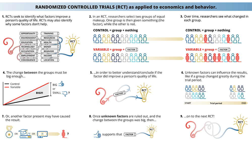
Again, putting visuals in front of a client and colleagues can show what's working and what's NOT. With this graphic being overcrowded and hard to read, I cut down the steps from 9 to 6; the infographic was also split in two to allow more space for each step, and the script was heavily revised from the text I had initially thrown together.
Again, putting visuals in front of a client and colleagues can show what's working and what's NOT. With this graphic being overcrowded and hard to read, I cut down the steps from 9 to 6; the infographic was also split in two to allow more space for each step, and the script was heavily revised from the text I had initially thrown together.
FINAL INFOGRAPHIC, PARTS 1 and 2. Credit: A. Kitterman/National Science Foundation.
With the content set, it was time to script the animation!
Since I no longer have to hold myself to "Instagram" standards, nor do these animations "on the side," thoughtful collaboration with the client and my teammates provided constructive feedback infinitely improved the "readability" of animations from start to finish.
The final products represent a collaborative process marked by effective communication and a determined focus to create end products that are engaging and educational. You can see the entire article and visual package here:
beta.nsf.gov/science-matters/bubble-bursting-causality-revealing-awesomeness.
The anatomy of a basic animation
FINAL STATIC ILLUSTRATION. Credit: Alice Kitterman/U.S. National Science Foundation
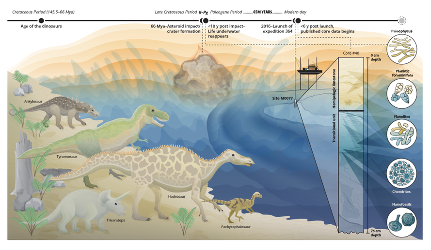
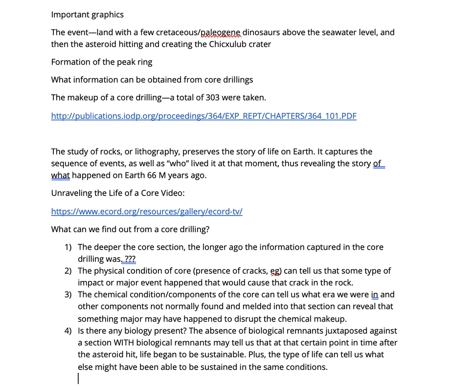
The Project: Produce a ~15 second animation (or a static illustration should time run out) depicting the moment of impact of the asteroid that ended the dinosaur age, for the NSF Science Matters article, "A moment that changed the world."
The Target Audience: The general public.
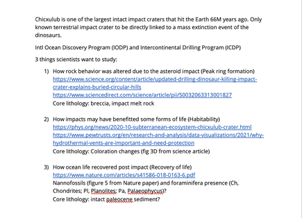
The Approach: This event has been visualized many times over, AND in gorgeous detail. Given what I needed to execute an animation and the time I had to do so, I chose to render in a full-vector, simpler style that would be infinitely editable. I also wanted to include information coming out of the data from the 2016 expedition to obtain core samples from the peak ring of the Chicxulub crater. Researchers hoped this data would elucidate/confirm answers to several questions, including: how soon did life underwater reappear in the crater environment?
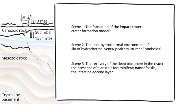
FIRST SKETCH: My first attempt was to focus on the modern day, with a vignette of the drill lift boat (L/B) Myrtle in place above the peak ring site to set the scene. The majority of the space at right is then reserved for 3 planned animated scenes.
Credit: A. Kitterman/National Science Foundation
The Client was wonderfully open to my suggestions, but kept asking to add in the dinosaurs and the asteroid; I would finally understand the importance of including these elements when reading the opening paragraph. The trickiest part was to then create a pleasing illustration that satisfied the "dinosaur-ophiles," but would have flexibility in function when compared to a pixel-based painting.
REVISED SKETCH: Open with dinosaurs (check) and asteroid impact event (check). The right half of the scene continues the story beyond asteroid impact. The layout is designed for a static and an animated product.
Credit: A. Kitterman/National Science Foundation
NOTES, RESOURCES AND OUTLINE for the storyboarding for the animation.
NOTES, RESOURCES AND OUTLINE for the storyboarding for the animation.
|
|
Credit: A. Kitterman/National Science Foundation
Picking the animation apart:
Picking the animation apart:
The Bones are the building blocks to be animated.

TOTAL TIME for research, concept sketching and initial planning: 2 weeks.
The Skin provides the packaging and is defined by rendering style. As mentioned before, I needed to design this first and foremost as a static illustration, and then plan for different levels of animation depending on the time I had left. Furthermore, with every project, I think about how whatever I draw can be repurposed: for example, the triceratops was modified from a previous illustration I had done, and so editing capability/flexibility adds value to anything created from scratch.
The Skin provides the packaging and is defined by rendering style. As mentioned before, I needed to design this first and foremost as a static illustration, and then plan for different levels of animation depending on the time I had left. Furthermore, with every project, I think about how whatever I draw can be repurposed: for example, the triceratops was modified from a previous illustration I had done, and so editing capability/flexibility adds value to anything created from scratch.

Rendering time includes continual research to ensure accuracy (e.g., for detail and relative sizing), incorporation of SME (Subject Matter Expert) corrections, testing color palette combinations and continual refinement of layout and design.
Although not necessary, I try to use the branding color palette exclusively when creating illustrations--adding only 1-2 outside colors if necessary--so that they feel branded. Other considerations like 508(c) must also be strictly followed: text overlying color fields must pass color contrast ratings for small type.
TOTAL TIME for rendering: 2 weeks.
The Organs do the work, so which "organ" functions best for which animated feature? In other words, what kind of movement best visualizes what is happening in the storyline? And how do deadlines affect planning?
If I had one day to complete the animation scripting, the simplest level of animation would depict change by dissolving elements on and off screen: the asteroid dissolves on as a small dot in the sky. Then, as the small dot dissolves off, a larger dot (which is the asteroid getting closer) dissolves on at the water's surface. Next, the static water dissolves off and a splashy depiction dissolves on. And so on.
If I had two days to complete the animation scripting, the next level would introduce spatial movement in key elements: instead of the asteroid dissolving off from one spot and dissolving on at another spot, it physically moves left-to-right through the sky.
If I had 3 days to complete the animation scripting, the most complex level would increase the number of spatially-moving elements, plus use special effects to describe the events themselves (like a particle world to depict the asteroid blowing up), or to add atmosphere (like water constantly rippling).
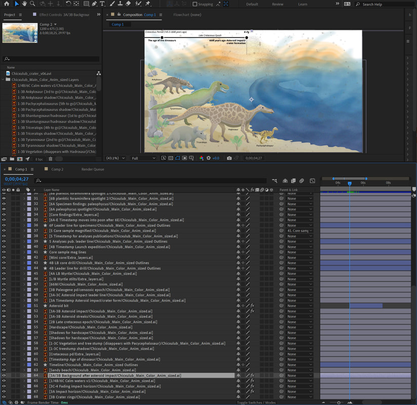
LAYER SET-UP for the Illustrator file that will be used in After Effects, has nearly 70 layers (left) and took a day to set up; AFTER EFFECTS COMPOSITION (right). Expect another day or two for file conversion, compression and any other tweaks to the final file itself.
|
|
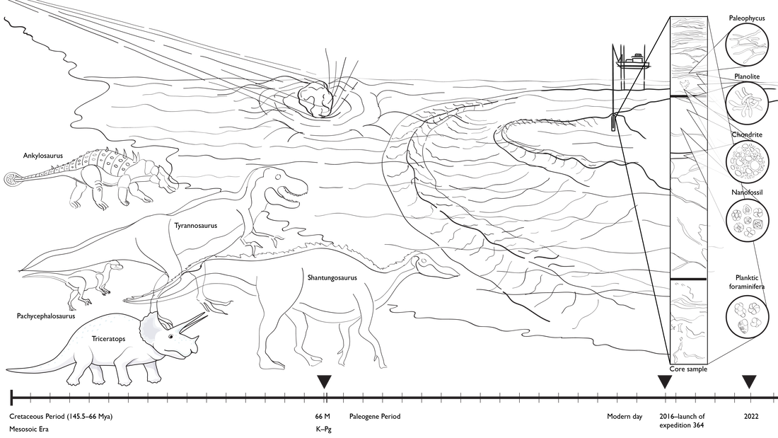
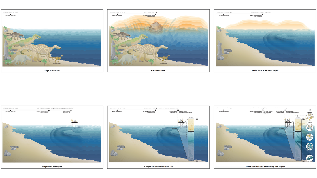
The Brain is housed in a storyboard, a group of illustrations where each scene depicts a change from the previous one, thereby laying out the path/trajectory of the storyline.
This series of changes convey occurrences taking place in a specific sequence, telling the viewer that something has happened as a result of something else. He/she/they interpret/s them collectively as an unfolding narrative.
EXCERPTS FROM THE STORYBOARD showing a "slideshow-type" animation. The final art was created first before final planning of the animated version.
The Final Product was a 19-second, non-narrated animation:
https://beta.nsf.gov/science-matters/moment-changed-earth?sf166210297=1
TOTAL TIME: 5 weeks.
And that's a wrap!
https://beta.nsf.gov/science-matters/moment-changed-earth?sf166210297=1
TOTAL TIME: 5 weeks.
And that's a wrap!
ANIMATIONS at Science
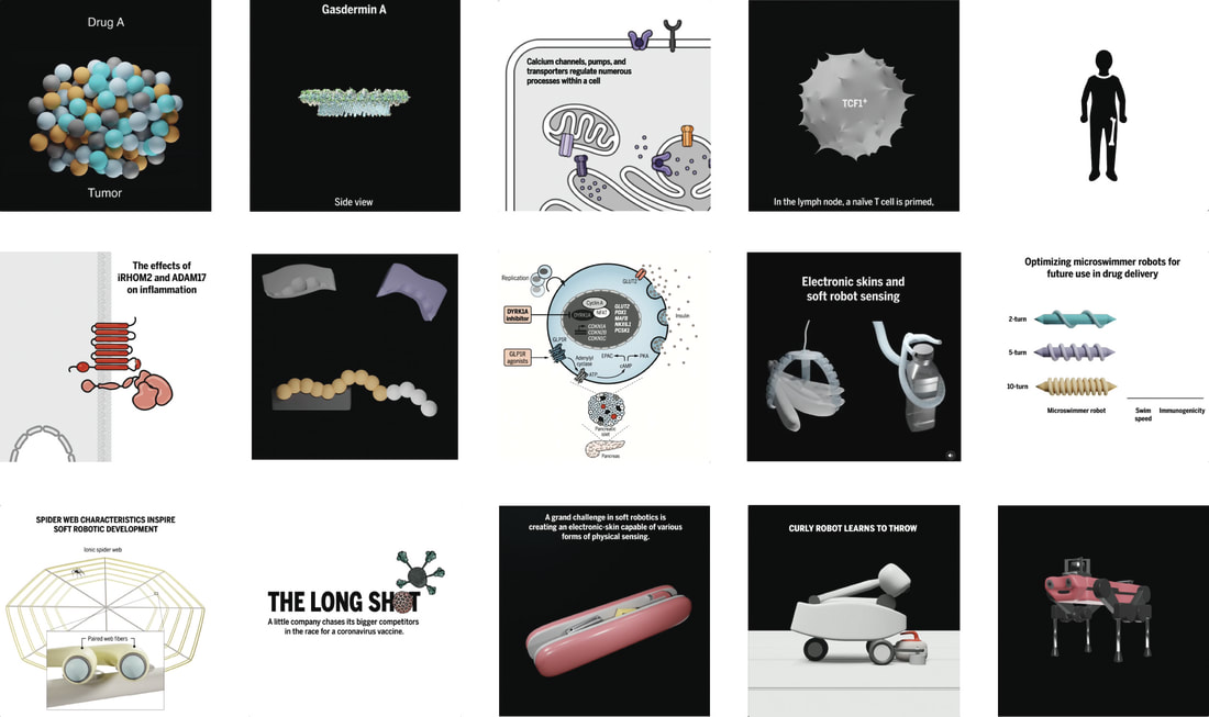
During my last year and a half at Science magazine, I created 2D/3D animations for the Science magazine Instagram site.
To view these, please click on the links below:
To view these, please click on the links below:
ANYmal C: the trekking quadruped
https://www.instagram.com/p/CKy7Y8KDahO/
Curly robot learns to throw
https://www.instagram.com/p/CKg53rTjb2J/
Physical sensor analogy for future soft robotic development
https://instagram.com/p/CJWO2R3HyK2/
The NovaVax vaccine for COVID-19 treatment
https://www.instagram.com/p/CHvPRX6syg1/
The synthetic spider web
https://www.instagram.com/p/CEJ9ckBnxd4/
Microswimmers in targeted drug delivery
https://www.instagram.com/p/CBnvVlynpsS/
Soft robotic grippers and dexterous manipulators
https://www.instagram.com/p/B_kayh3HDBz/
Drug combinations for diabetes therapy
https://www.instagram.com/p/B9mkcsIFzQ4/
Monoclonal antibodies know their targets
https://www.instagram.com/p/B7_W6r7lw-T/
Inflammation via iRHOM2 and ADAM 17
https://www.instagram.com/p/B4z8HLEAiJ0/
Measles impacts B cell immunity
https://www.instagram.com/p/B4h6ssojmhS/
Immune checkpoint blockade revives exhausted T cells
https://www.instagram.com/p/B4AVR4YFH0t/
Calcium ions
https://www.instagram.com/p/B2wgqRZAWlS/
Gasdermin formation signals death
https://www.instagram.com/p/B2UFDIoDiBp/
Chemotherapy strategies to shrink tumors
https://www.instagram.com/p/B1wPuRcHEOB/
This link leads to an external site that hosts my 2D animation/motion graphics portfolio. I was introduced to 2D motion graphics in 1999 using Adobe After Effects. I continued learning on my own by creating animation projects based on illustrations I had created, in this way forcing me to explore the capabilities of the program.
When I went freelance in 2004, I took several years' hiatus to build up business before getting back on that learning curve with more self-driven projects specifically designed to explore After Effects' potential.
When I went freelance in 2004, I took several years' hiatus to build up business before getting back on that learning curve with more self-driven projects specifically designed to explore After Effects' potential.
