A.Y. Chen Illustration & Design
  • Home
  • Portfolio
    • National Science Foundation (NSF)
    • Science magazine art
    • Vector Art
    • Black & White
    • Classic work
  • Animation
  • Blog
  • Contact
  • Children's book art

What makes an infographic compelling

3/27/2015

0 Comments

 
Infographic of genetic originas of dog breeds, Science Friday's rise of the infographic
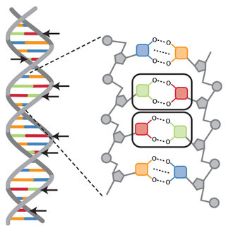
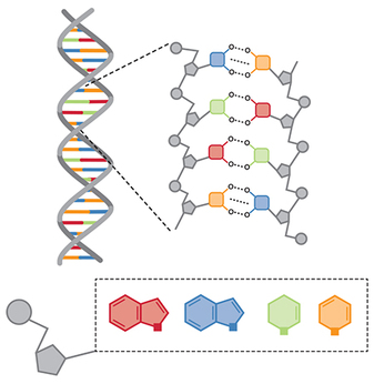
Image from: http://www.sciencefriday.com/blogs/10/18/2013/show-not-tell-the-rise-of-the-infographic.html?series=20
An infographic not only condenses a large amount of data into a single, elegant picture, but it has been the "new" buzzword in science as well as graphic design.
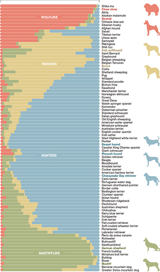
In this infographic, color coding is used to tie in the genetic make-up of 85 breeds of dog into 4 genetically distinct categories. So if you look at the first line, the Shiba Inu dog, most of its line is red. This means its predominantly wolf-like in its genetics, as red represents the wolf-like category. As you look at the rest of the graphic, you see red is present in all other dog breeds, but much less so. So, what can you infer about the Saluki or the Schipperke, in comparison with the Shiba Inu?
Infographics use imagery as the "bridge" between the data and the comprehension of it into one or more general themes. Imagery is furthermore more compelling, and provides clues as to what the image might mean. When you see the outlines of the dog, you probably guess that this image/article is about dogs. So, infographics not only deals with packaging up complex data, it serves to gain our interest to read on!
0 Comments

Infographics

3/25/2015

0 Comments

 
Infographic of mass extinctions in history, Science Friday's Show not tell the rise of the infographic
Looking at my last image of the neuron, notice that the information is given in illustration and text format. These elements are then arranged in proximity to one another so that the viewer/reader understands that certain text goes with certain images or parts of images. This is the simplest version of an "infographic." But the true infographic strives to encapsulate a huge mass of information into a comprehensive, understandable, big-picture, take-home message.
There was a story on Science Friday way back in October 2013 on infographics–putting big data into a visual format–which explains what makes a good infographic, and provides examples:
http://www.sciencefriday.com/…/show-not-tell-the-rise-of-th…
But I believe one of the most important messages from this story was: “If you don’t dig deep, it’s very easy to be mislead.”
I too get lured by sensational articles, but make it a habit to double check that article against a reliable source. My go-to's are Mayo Clinic, Johns Hopkins, AAAS, or NIH sites. And always corroborate the information you get with at least two other sources!
--Story on “Making Sense of Science Infographics”
http://www.sciencefriday.com/…/making-sense-of-science-info…
0 Comments

The key to cells and other interesting facts

3/20/2015

0 Comments

 
Collage of different types of cells
For those who are curious (simplified definitions):
Top left: Dendritic–A specialized white blood cell for immune defense). Middle left: Red blood cells (red discs–oxygen carriers); white blood cells (purple nuclei); platelets (tiny lighter red–blood clotting); lymph nodes (light brown beans arranged like a net–garrison for immune cells; filters for bad stuff). Top right: Epidermal–Type of cell in the top-most layers of your skin.
Middle left: Type of tumor cell. Middle middle: Macrophage–A cell that gobbles up the bad stuff in your body. Middle right: Neutrophil (type of white blood cell). Bottom left: Osteoclast–A cell that breaks down bone for remodeling. Bottom middle: Columnar–A special kind of highly absorbent cell lining all body surfaces. Bottom right: Stromal (long skinny tapered)–A cell that physically supports and helps maintain others. Tumor (ovoid with purple nuclei).

Neuron cells versus dendrite cells
Another word about cells: certain ones resemble others. The dendritic cell from my collage for example can be mistaken for a NEURON, which also has dendrites, or branched arms extending from the cell body. In the lower illustration, I included glial cells to show some structural variations.

The big difference is in function, for a dendritic cell helps to stimulate your immune system cells into action, whereas the neurons are your brain cells.

0 Comments

From DNA to cells...

3/18/2015

0 Comments

 
Picture
Our DNA resides within each and every cell in our body, which is in my opinion, one of the most amazing things about biology. Each cell is a self-regulating machine that sustains itself. But combined, cells work together to either become a single organ, like a muscle or a liver, or a team that works toward a common function, like the cells of your immune system. In this graphic, there are many kinds of cells depicted, and as different as they appear, so too is their diversity in function. Can you name 3 or 4 of the cells shown?
0 Comments

Principles of art and design

3/11/2015

0 Comments

 
Here's the answer to the mistake I made on this illo: I put a red element against a green one, and red/green color blindness is the MOST COMMON form of color blindness, which in general affects 1 in 10 men!
The rungs of the DNA ladder are made of specific base pairings, so I chose complementary colors on the color wheel (blue and orange are also complementary) in an attempt to apply basic color principles to help reinforce color coding. Instead, I ran smack into the red/green juxtaposition.
So as medical illustrators, we try to apply basic principles in art, whether it comes to layout and design principles or color theory to help teach scientific concepts. In the above, a typical layout concept is using a zoomed-out version of an image to orient the viewer as to where the magnified view in the insert originated. Further, I used complementary colors to associate the base pairs that specifically link to each other. The blue-colored bases will always and only pair with orange, and the red will only and always pair with green.
Complementary color coding in DNA, DNA base pair identification with color coding
0 Comments

Introduction to medical illustrators and the amazing world of science

3/6/2015

1 Comment


Picture
My name is Alice, and as a person who was NOT very good at science when I was younger, I am now absolutely consumed by and obsessed with it. Therefore, my aim with this blog is to find better ways to communicate pretty complex topics in science, health and medicine. Better science education will only better us all. As our lives get more and more complicated, understanding and taking our health in our own hands is frankly more critical. But, not all websites are created equal, and so, I also want to talk about being shrewd in your reading of the various sites you encounter...including my posts!

I'll start out explaining how I do what I do. I apply basic art principles to my science drawings, to help make learning and retention easy and fascinating.

In this picture, I use color coding to show how DNA is built. I've omitted labeling so you can tell me what YOU see!
1 Comment


    The purpose of this blog is to explore more effective and exciting ways to communicate science.

    Archives

    June 2017
    May 2017
    April 2017
    March 2017
    February 2017
    January 2017
    December 2016
    November 2016
    October 2016
    September 2016
    August 2016
    July 2016
    June 2016
    May 2016
    April 2016
    March 2016
    February 2016
    January 2016
    December 2015
    November 2015
    October 2015
    September 2015
    August 2015
    July 2015
    June 2015
    May 2015
    April 2015
    March 2015

    RSS Feed

Powered by Create your own unique website with customizable templates.