A.Y. Chen Illustration & Design
  • Home
  • Portfolio
    • National Science Foundation (NSF)
    • Science magazine art
    • Vector Art
    • Black & White
    • Classic work
  • Animation
  • Blog
  • Contact
  • Children's book art

DNA replication

4/29/2015

0 Comments

 
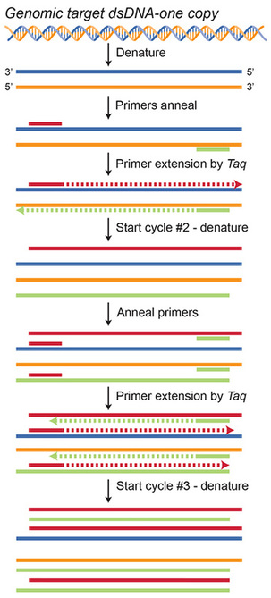
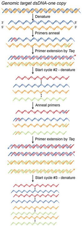
In the previous post's image, the original 2 strands made by pulling apart 1 double-stranded DNA now each get its compliment made, making each single strand a double strand! So, when we repeat the process in cycle #2, each of the 2 double-stranded DNA copies gets pulled apart to serve as 4 single-stranded DNA templates. This means at the end of the copying cycle, we'll now have 4 double stranded DNA copies that will again be pulled apart to serve as 8 single-stranded DNA templates. And so forth and so on.
Polymerase chain reaction, PCR, DNA replication
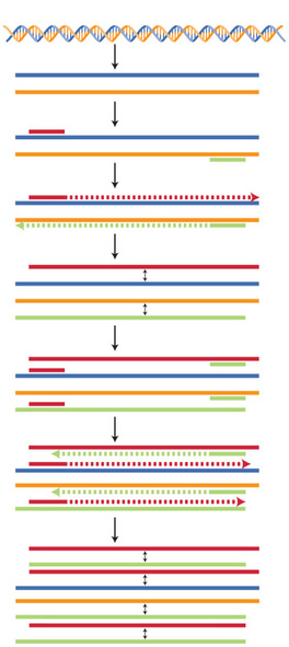
In this representation of DNA replication, I'm no longer using simple lines nor the double helical structures to represent the DNA. Instead, I'm using a rounded-cornered square to represent each base pair that is chained to the next base pair. In step 1 the base-pair blue chain is pulled apart from its (complimentary) orange chain, and becomes the template for a new complimentary copy to be made to each chain.

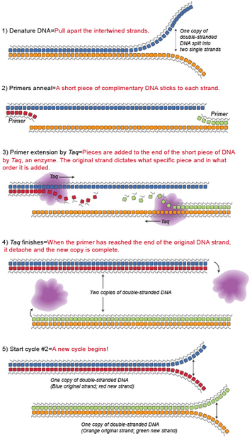
As you see, the color coding is consistent with the images from the previous posts to hopefully make it easier to follow along as I apply the same principle to this version. You'll see that once the primers in step 2 are stuck to the single-stranded DNA template, new base pairs complimentary to the template are added to the chain with the help of the enzyme (purple hand-like blob) Taq. Finally, in step 5 the 2 new double-stranded DNA copies are now themselves pulled apart, just as they were in cycle #2 of the previous post, to now serve as 4 separate single-stranded DNA templates with which to make 4 new double-stranded DNA copies!

0 Comments

How DNA copies itself

4/24/2015

0 Comments

 
Polymerase Chain Reaction, PCR, DNA replication
The left image is the same one shown in the last post, only now with labels. In the right image I use the actual structure of DNA, rather than the simple colored lines, to represent the two strands that make up one whole strand of DNA. Here you can use the color coding to understand how these two images correlate.

The very simplified explanation of how DNA copies itself is that one whole DNA strand, made of one blue and one orange strand, is first unwound and then separated. Special pieces of DNA called primers–the short red and green lines–stick (anneal) to each unwound DNA strand, because each is designed to be the compliment base pair sequence as that stretch of DNA. Taq, the enzyme, can now stick to the primer and read the DNA sequence in the direction of the arrow, adding each compliment base pair to the end of the primer in a chain-like manner. Therefore, the beginning of the new strand starts with and incorporates the primer.

Now, can anyone tell me what's happening in cycle #2?
0 Comments

It all begins with DNA

4/22/2015

0 Comments

 
Polymerase Chain Reaction, PCR, DNA replication, color coding technique in illustration
We have been talking about cells and the significance of their specialization and organization into organs to serve a particular function. So, I want to begin with how DNA-found in every cell in our body-makes copies of itself, with this picture that shows how we've duplicated this process in the lab. Without knowing anything about the process, but knowing something about color coding, what can you see in this picture?
0 Comments

A Diversion

4/17/2015

0 Comments

 
Picture
Every once in a while I like to throw in fascinating images I find on the web. Here's an amazing photo of a Chinese soft-shelled sea turtle embryo developing its shell, from the National Geographic, Nov 2013 issue.
Many of us have seen photos of developing human embryos, but likely few of us have seen one of a turtle embryo. When you look at these images, the first three stages photographed here are virtually indistinguishable from those of a human embryo.
Thanks again to National Geographic for providing us with this photo.
0 Comments

This is what happens with a little organization

4/15/2015

0 Comments

 
Organ of Corti, Hair cells, ear anatomy
The answer to the question in the last post about what else is secreted by the pancreas is: INSULIN, a very important substance that helps to regulate blood sugar levels.

Cells are not just the structural building blocks of an organ, but, they can perform specific functions within that structure. For the pancreas example, certain cells that secrete juices destined for the small intestine organize themselves along ducts to secrete the fluids they produce directly into the ducts. Another example is the Organ of Corti (CORE-Tee), a fascinating piece of anatomy of our ear. Shown here in cross-section of the cochlea if you unwound it into one long tube and sliced it perpendicularly to the length of the tube (think of slicing cookies from a roll of dough). The HAIR CELLS (pink finger-shaped cells) within the spiral of the cochlea are arranged along the spiral length so that higher frequencies that only travel a short distance through the fluid are triggered by the cells closest to the opening or entrance, while lower frequencies that travel further distances are triggered by those toward the end
of the tube or center of the spiral. The hair cells then change the sound vibrations to electrical impulses that the auditory nerve then relays to the brain for interpretation.

So think about how remarkable it is that not only do cells conform shape-wise to fit the structural necessities of an organ, but they further organize positionally to serve that organ best, while being machinery within that organ to perform the collective function of that organ!

0 Comments

Cells and the power of organization 

4/10/2015

0 Comments

 
In that last image, the color coding of red, blue and purple cells correlates to the color coding in the larger, zoomed-out, simplified view from the lower left image, and lets you know where you are looking within the structure which is from the pancreas. There are many specialized cells within the pancreas because so many things are secreted from there. For one, pancreatic juice, which aids in digestion, is secreted by the acinar cells pictured in purple. Can anyone think of something else the pancreas cells provide? Hint: has to do with blood sugar regulation!

Cells organize themselves into an organ like the pancreas. Even though you can think of cells as building blocks like Legos, each type of cell does something very specific, just like you do at your job in your company. In this collage, you can see what these cells really look like with the highly magnified histology photos included. What’s nice about an illustrated version is that you can “see” each cell more clearly and how it makes up the resulting structure.

Specialized cells of the pancreas, acinar cells
0 Comments

More on the power of color coding

4/8/2015

0 Comments

 
Specialized pancreatic cells, acinar cells
Although I don't want to belabor the point about using color coding, I guess I am, because its use, especially in technical illustrations, is such a simple and yet powerful tool that we as illustrators have to communicate concepts to our audience. Color changes used in a map can tell the viewer what type of terrain a road goes through, what kind of road it is, and boundaries between counties the road crosses through. Likewise, color changes in medical illustrations can tell the viewer similar information like what part of a structure a we are looking at, even if we cannot identify the structure itself. Color coding can also hint at the fact that there are several different types of cells that make up this structure. So, take a look at this image. Can you determine some things about it without even knowing what it is?
0 Comments

The mistakes we make

4/3/2015

0 Comments

 
Picture
From time to time, it can get quite complicated even to a trained graphic artist or illustrator what rules to follow and what to modify. And I must admit, it makes me feel better to see that I'm not the only one making these types of mistakes. We all strive to do the best we can for our clients, but we are also human. The trick is to laugh about it, and learn for the next time.
What I'm talking about specifically is that when we use the power of color coding to help make association in concepts digestible. But in the application of one color theory rule we sometimes make less obvious errors. Take for instance, using complimentary colors to associate two objects within a picture. Complimentary colors are pairs of colors opposite each other on the color wheel: blue and orange, yellow and purple, and red and green, for instance. We employ these color combinations together because visually they accentuate each other the best.
However, the use of red juxtaposed against green poses problems for color-blinded individuals, which as we stated in an earlier post, affects 1 in 10 men. So for images used in the science fields we aim to NOT follow the complimentary rule for this one particular pair.
Therefore, I'd like to leave you with an homage to many of the red and green mistakes I have made in the past, in hopes that they will only be distant memories!
0 Comments


    The purpose of this blog is to explore more effective and exciting ways to communicate science.

    Archives

    June 2017
    May 2017
    April 2017
    March 2017
    February 2017
    January 2017
    December 2016
    November 2016
    October 2016
    September 2016
    August 2016
    July 2016
    June 2016
    May 2016
    April 2016
    March 2016
    February 2016
    January 2016
    December 2015
    November 2015
    October 2015
    September 2015
    August 2015
    July 2015
    June 2015
    May 2015
    April 2015
    March 2015

    RSS Feed

Powered by Create your own unique website with customizable templates.